Use Cases
Monitor and Analyze Process Operation
We consider the operation of the depropanzier column show in Fig. 46. Since there are dynamics and delays involved, all the tags are time shifted relative to the feed (Several tools are available to help construct shifted signals for time alignment. One option is the open source Correlation Add-on available from Seeq’s Add-on Gallery). It is also known that the reboiler valve output (Reboil Valve OP) is configured as reverse acting i.e. increasing output (OP) values close the valve i.e. less reboil.
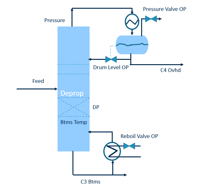
Fig. 46 Depropanizer Column.
Below in Fig. 47 is the trend view of nearly 5 months of operation.
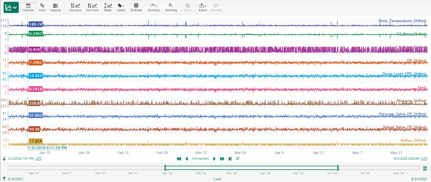
Fig. 47 Depropanizer Column. Trend view of nearly 5 months of operation.
Using the Parallel Coordinates in Seeq Add-on/Plugin, the same data can be viewed as shown in Fig. 48.
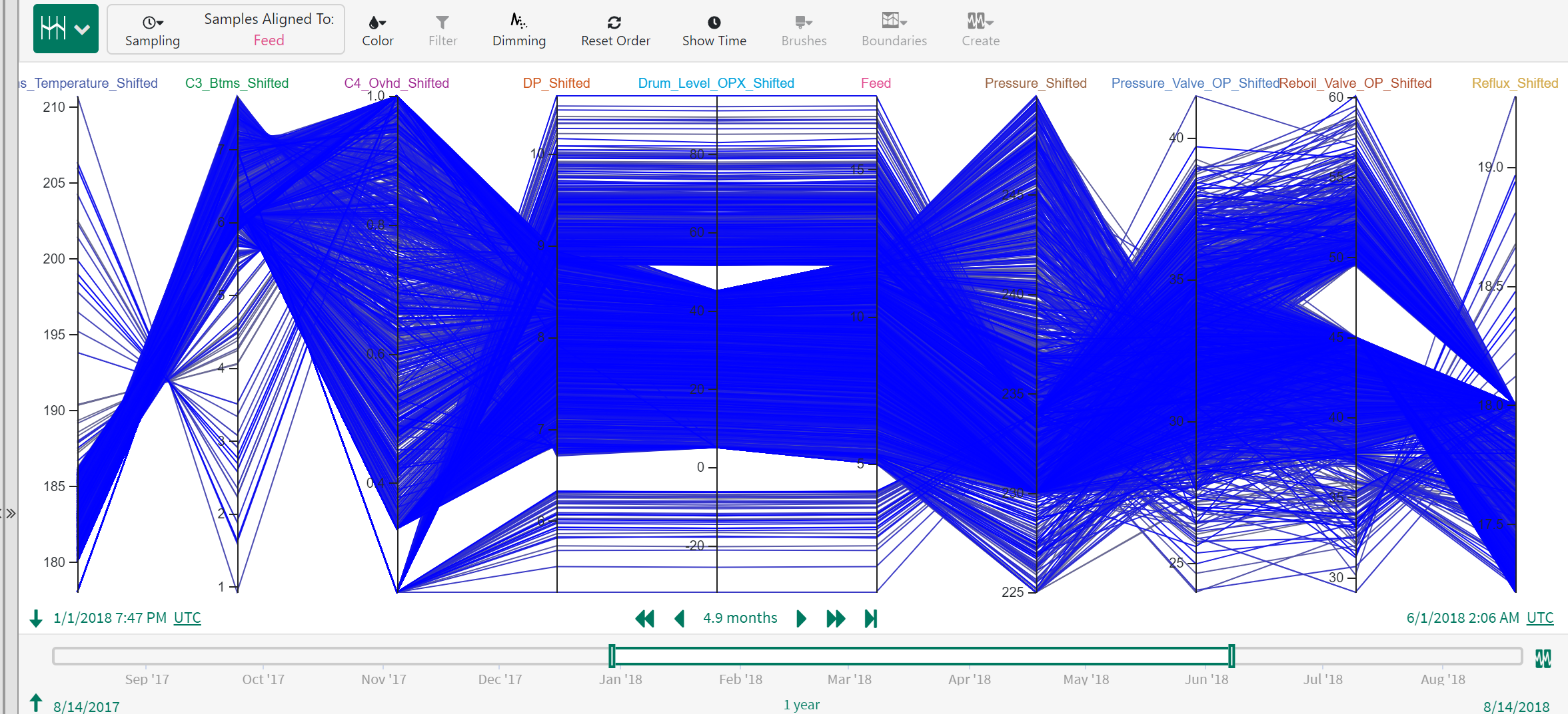
Fig. 48 Depropanizer Column. Parallel Coordinates view of the same nearly 5 months of operation (Trend view Fig. 47).
In this case study, we are interested in analyzing periods when the overall separation in the column is poor i.e. when the quality specifications C3 in the bottoms and C4 in the overhead are higher than desired. We start by coloring the lines using C4 Ovhd. Notice in Fig. 49 that the higher values of C4 Ovhd appear in brighter magenta while lower values are grayish.
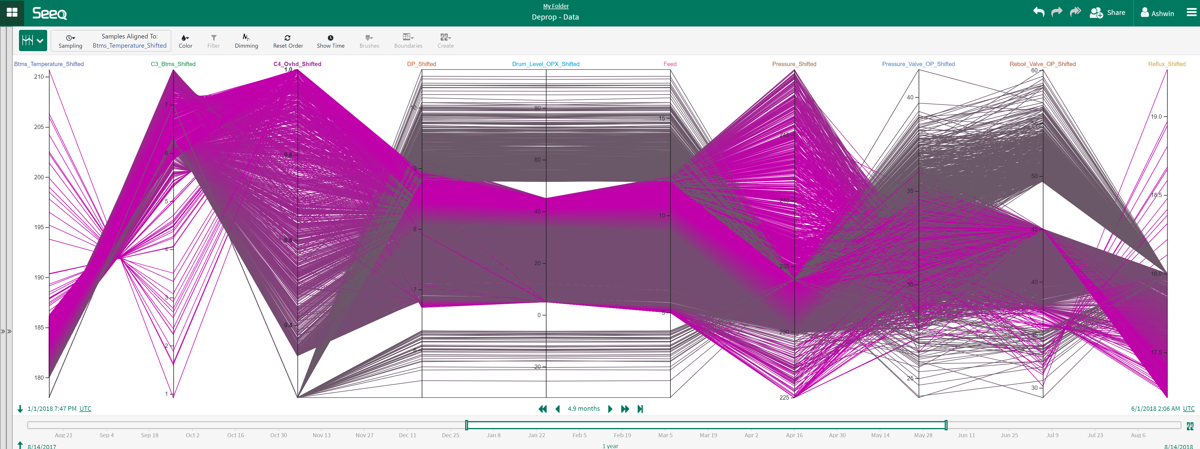
Fig. 49 Parallel Coordinates view colored using C4 Ovhd.
Brushes are used to approximately mark high C3 Btms (>= 7) and high C4 Ovhd (>= 0.9) as shown in Fig. 50. It is evident from Fig. 50 that during these periods of poor separation, the column reflux is at the low end of operation. This is useful information that matches physical understanding and can be shared with operators and operations personnel.
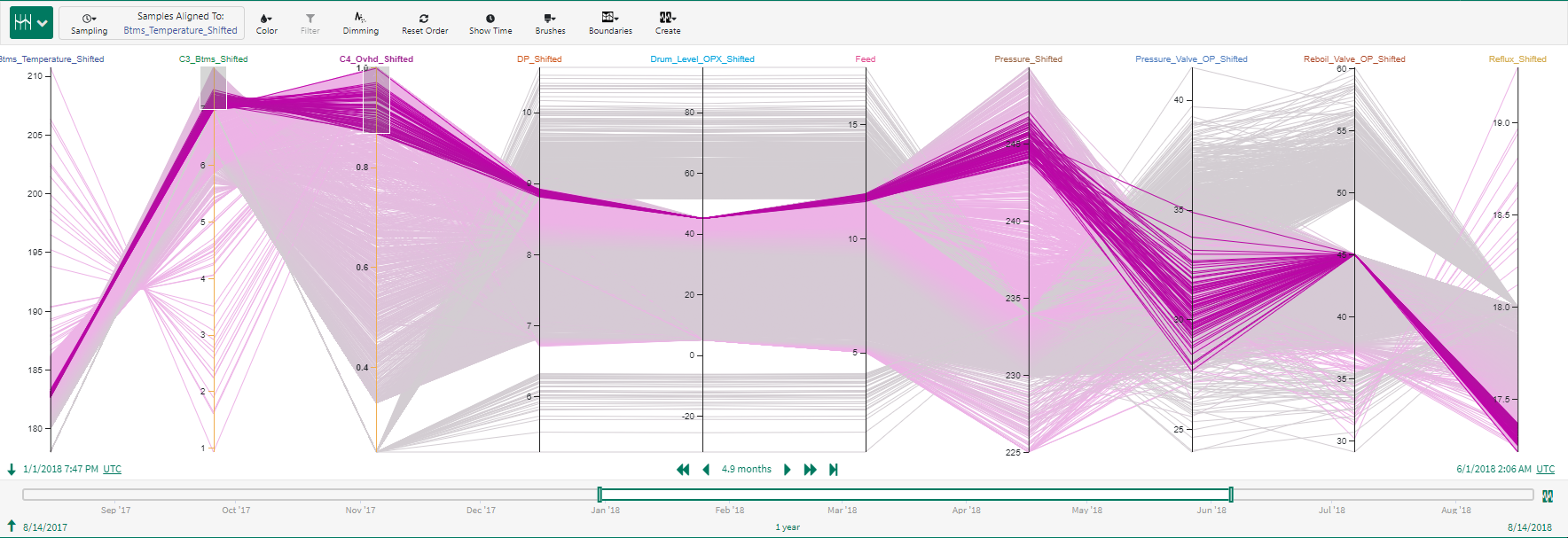
Fig. 50 Parallel Coordinates view of periods of poor column separation.
Using the time axis, it becomes clear that the poor performance periods are spread across the times of interest and are not restricted to a particular time period.
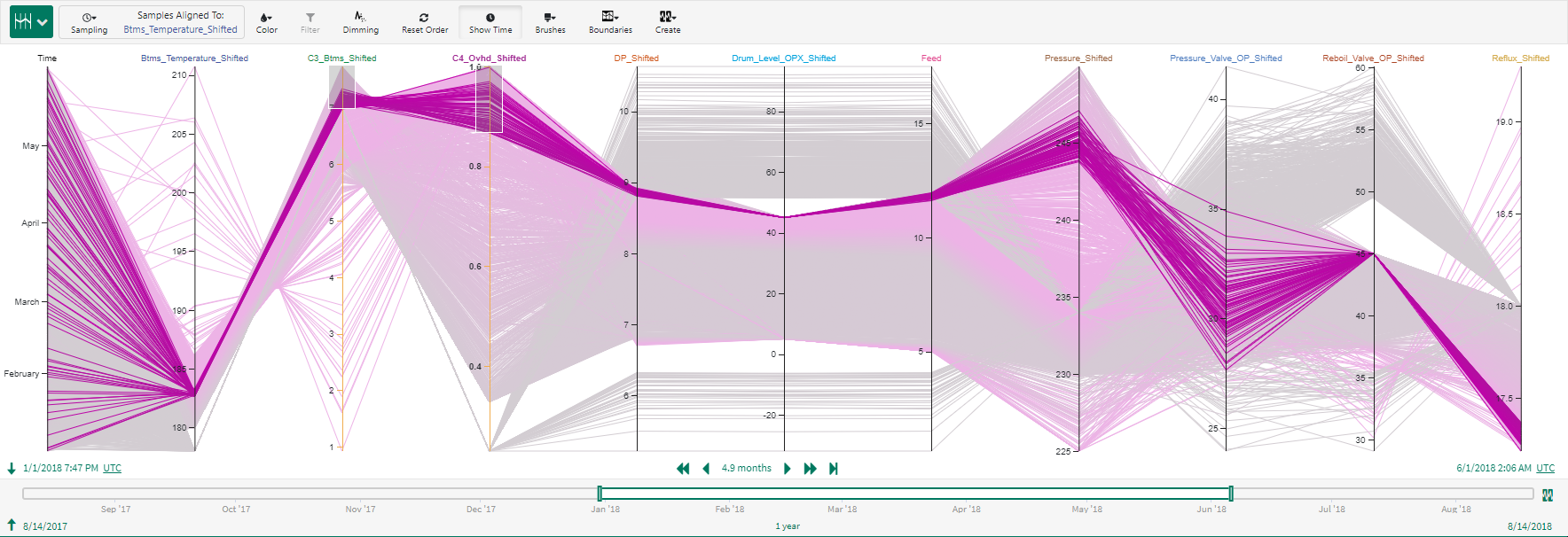
Fig. 51 Time axis view with Parallel Coordinates. Poor column performance is spread across months.
Using the Brushes button, the brushes can be placed at the desired operational limits (see Fig. 52). This provides an accurately view of poor separation periods in the column (Fig. 53)
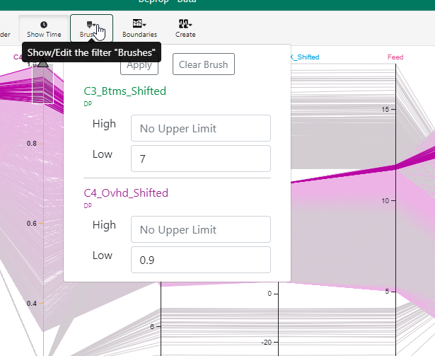
Fig. 52 Set precise limits using Brushes.
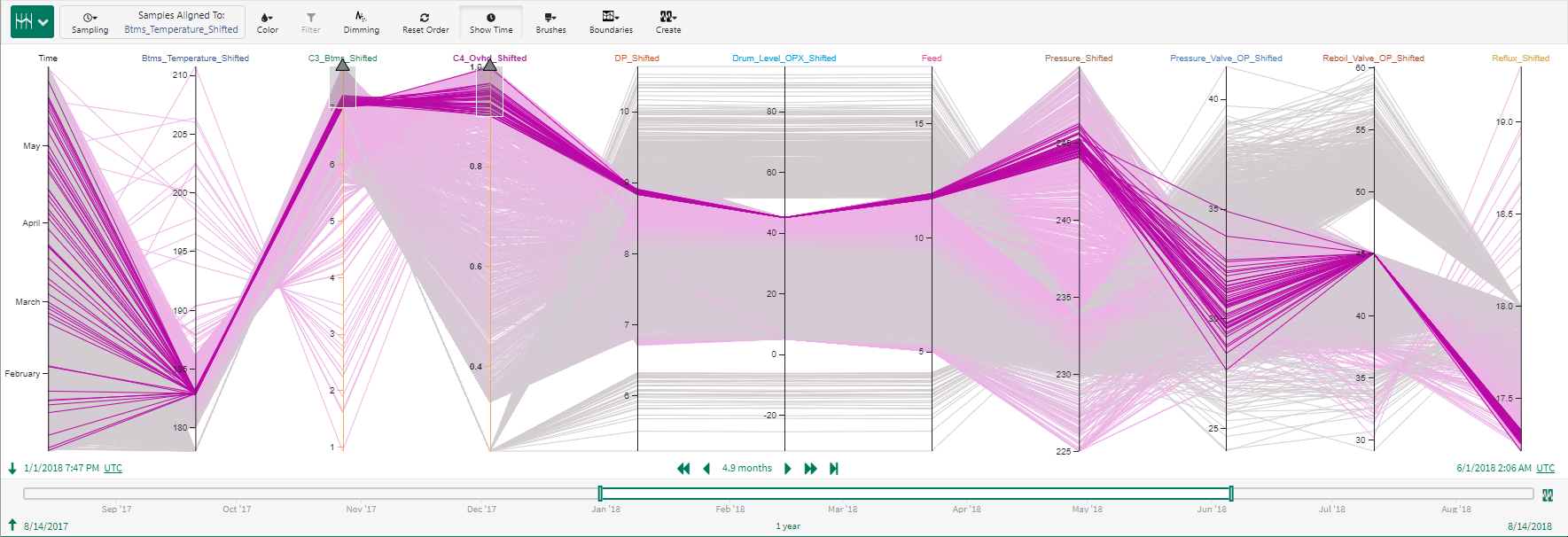
Fig. 53 View of poor separation periods. Note that the column reflux is consistently low in these periods of poor separation.
Having identified poor separation periods and its potential cause, a Seeq condition Poor Separation can be created from Parallel Coordinates to monitor future poor separation periods.
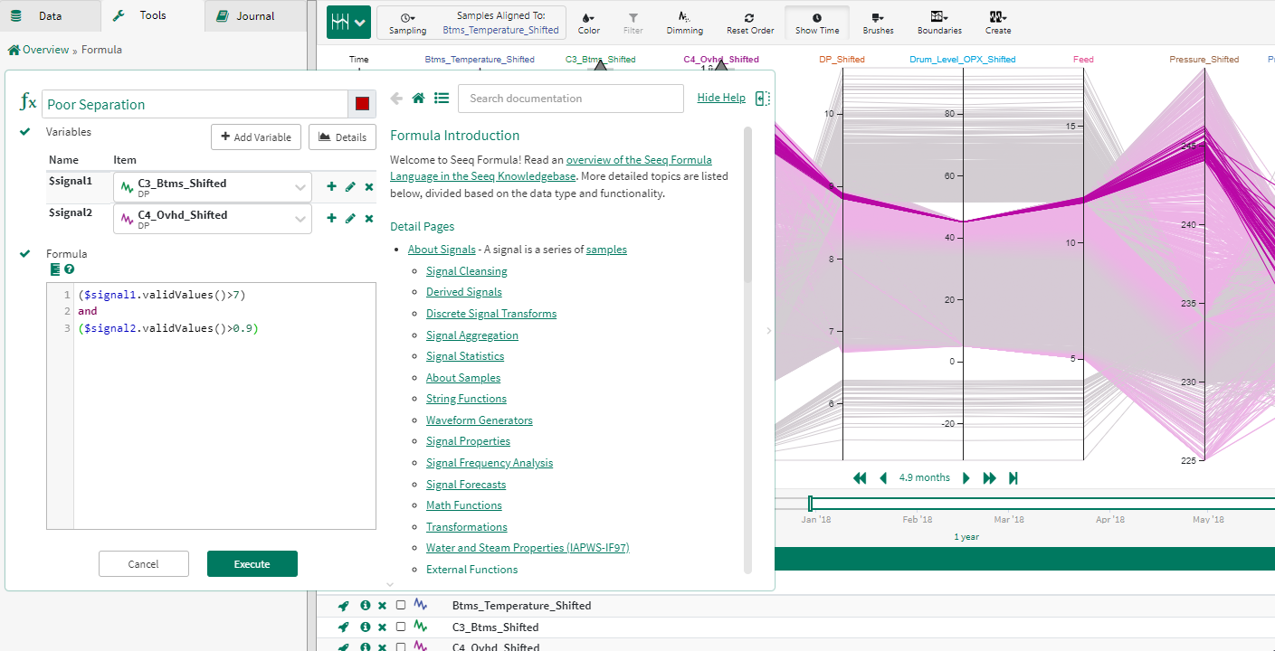
Fig. 54 Create a Seeq condition called Poor Separation to monitor poor separation periods for the depropanizer.
Using the color by condition option, lines belonging to the Poor Separation condition are shown in red in Fig. 55. Using the Filter enables us to isolate the lines belonging to the Poor Separation condition (Fig. 56). Almost immediately it becomes clear that the Drum level valve output (Drum level OPX) is always constant during these periods indicating the loop was left in manual mode. This may help explain why reflux rates remained low during these poor separation periods. A similar insight can be derived for the reboil valve output, this loop also seems to have been left in manual mode which likely made the separation worse.
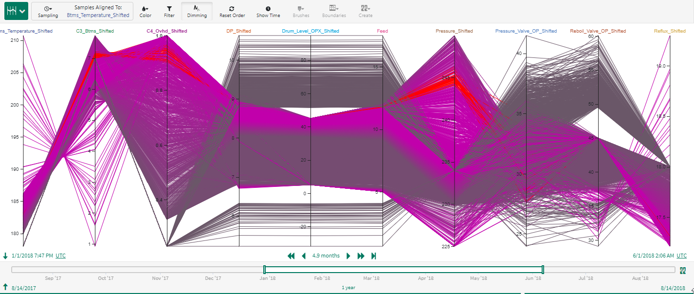
Fig. 55 Lines belonging to Poor Separation condition are colored in red.
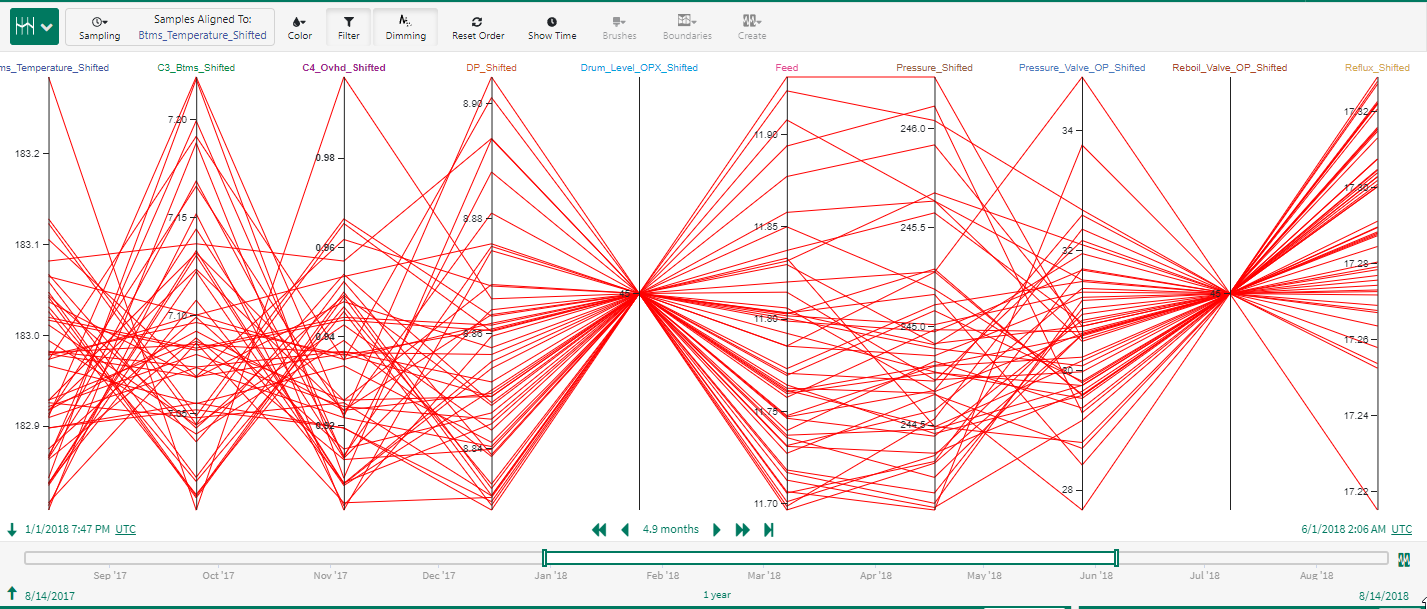
Fig. 56 Isolate lines belonging to Poor Separation condition. Note that Drum Level Valve OPX is constant during the condition indicating the loop was in Manual.
A similar visual analysis can be carried out for periods with high column DP. For this column, it is clear from the parallel coordinates view that high column DP is typically encountered at high feed rates and close to maximum reflux.
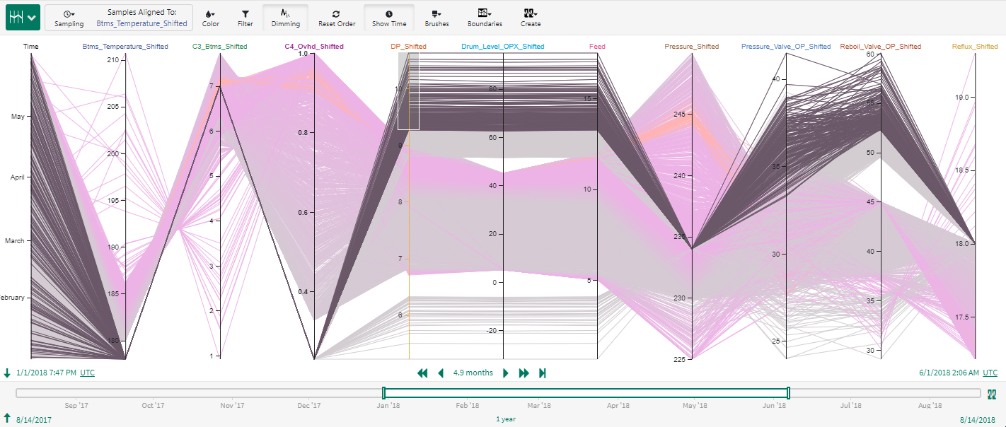
Fig. 57 Using parallel coordinates for quick visual investigation of high DP conditions in the column.
Visual Analysis of Batch Operation
We consider the basic oxygen steel (BOS) making process described here. This is a batch manufacturing operation. The interest here is to perform a quick visual examination of the multivariate time series data to understand unique characteristics (such as operation ranges) of the identified Golden Batch. The batch data along with the identified Golden Batch is shown in Fig. 58. Parallel Coordinates in Seeq is a handy tool to perform such quick, visual analysis of batch data.
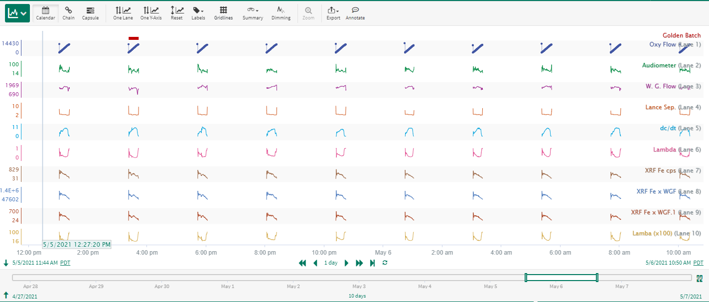
Fig. 58 BOS batch data with identified Golden Batch.
Using the Show Time button and coloring by both Oxy Flow and the condition Golden Batch, an equivalent parallel coordinates display is shown in Fig. 59.
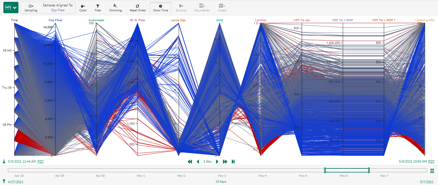
Fig. 59 Parallel Coordinates view of BOS batch data colored by Oxy Flow and the condition Golden Batch. Notice that with the Show Time button activated, the identified golden batch (in red) is easily identifiable on the time axis.
Using a brush on the time axis, the operation of the Golden Batch can be isolated and compared visually against other batches (see Fig. 60).
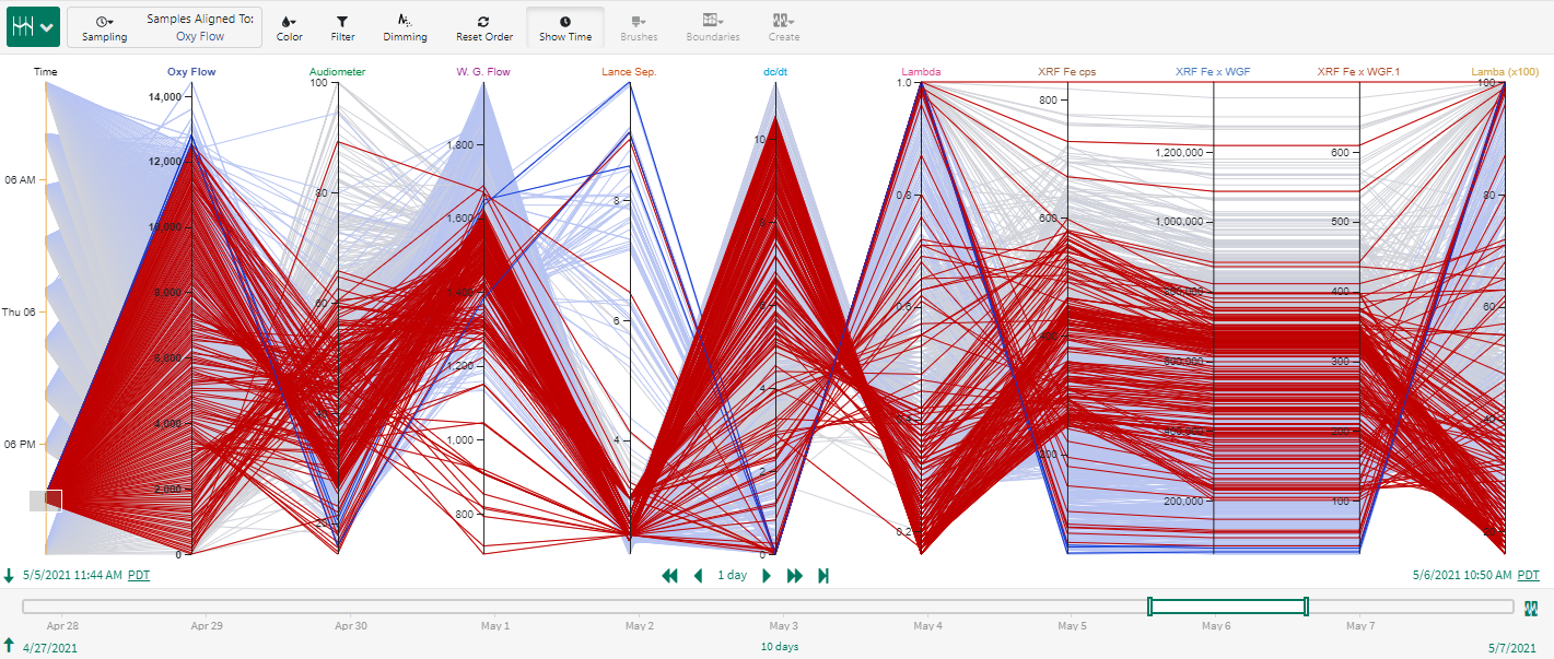
Fig. 60 Isolate operation of the Golden Batch for visual examination and compare against other batch data.
A quick visual examination reveals that a majority of W.G. Flow during the Golden Batch lies between 1200 and 1600. Similarly the bulk of Lambda measurements during the Golden Batch lie below 0.4. As a quick first experiment, we can set up brushes for above identified variable ranges. This is depicted in Fig. 61.
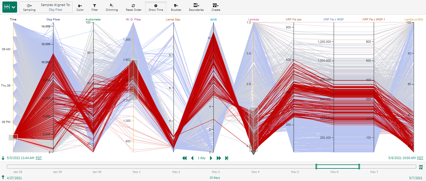
Fig. 61 Analyze operation of the Golden Batch. Easily validate/invalidate hypotheses and gain process insight.
Since the red lines in Fig. 61 looks to be a reasonable approximation for the profiles in the Golden Batch, we will proceed to create a condition for W.G. Flow and Lambda. We will call this condition Good Operation.
Coloring and filtering by both conditions (see Fig. 62) allows a comparison of how well the simple condition can approximate Golden Batch operation.
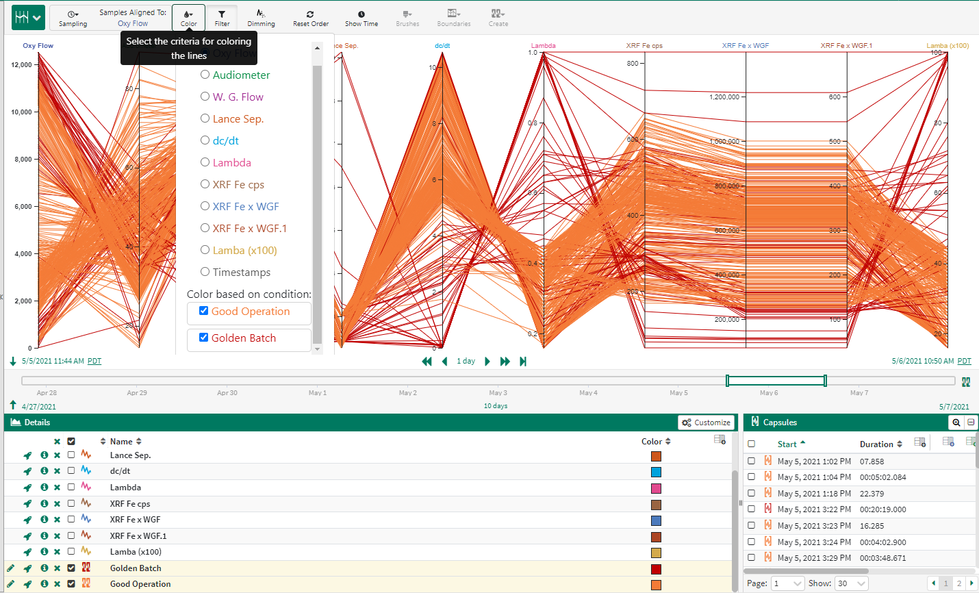
Fig. 62 Assess how well the simple condition approximates the overall Golden Batch operation.
While the simple condition derived visually from the parallel coordinates view has approximated certain sections well, there are periods the simple representation has not fully captured. Nevertheless, we have derived quick, visual process insight on the operation of the Golden Batch in terms of W.G. Flow and Lambda. We can also examine a time trend view in Seeq to analyze periods in other batches that are within the identified Good Operation condition; this is shown in Fig. 63
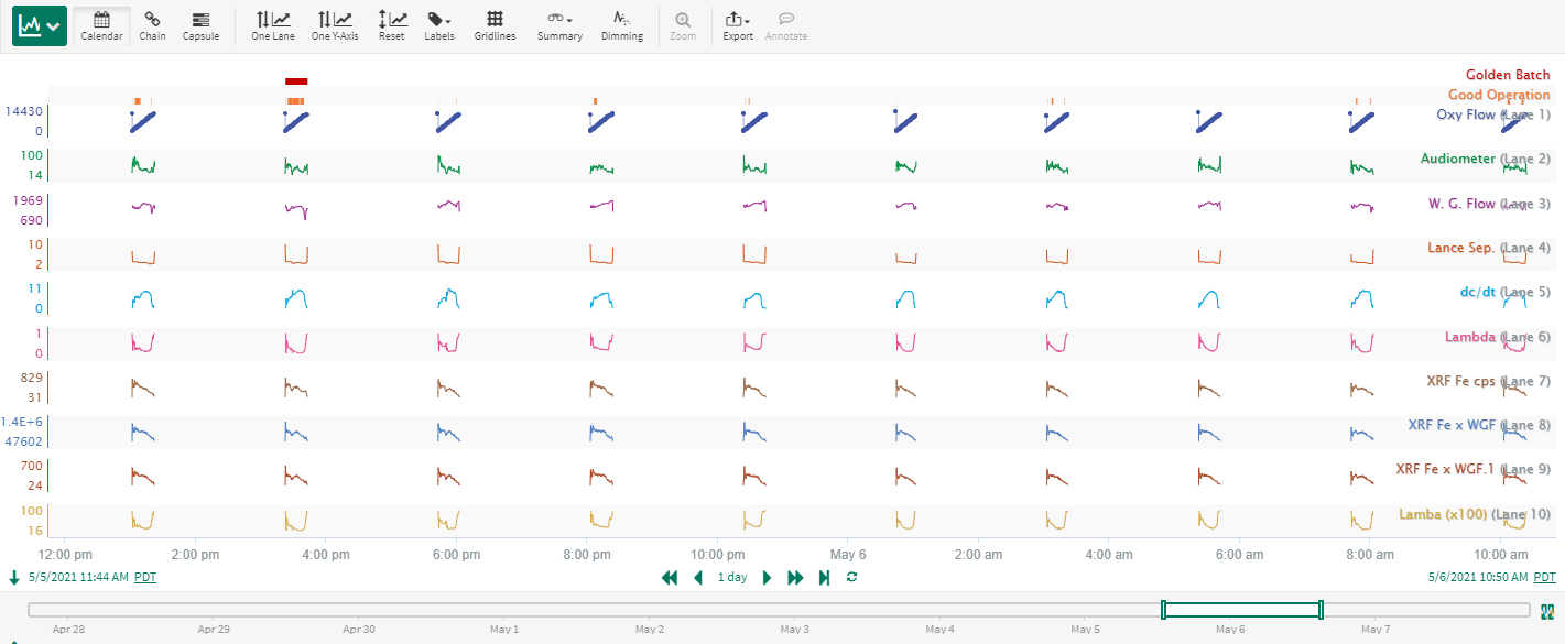
Fig. 63 Identify periods in other batches that are within the Good Operation condition.
Additional visual analysis can be performed using Parallel Coordinates to refine this simple representation further. The process insight gained can be a valuable starting point for tools such as Multivariate Pattern Search (MPS).
Visual KPI Analysis
Parallel Coordinates enables visual analysis of KPIs and any tradeoffs. In the case study below, the pump health KPI for 7 pumps were visually analyzed. Pumps 7P0300, 7P0665 and 7P0666 belong to Train A while 8P0300, 8P0665 and 8P0666 belong to Train B. 3P0100 is a common feed pump for the two trains. A small duration of abnormal feed was encountered during the analysis period. This period is depicted by the Abnormal Feed condition in Fig. 64
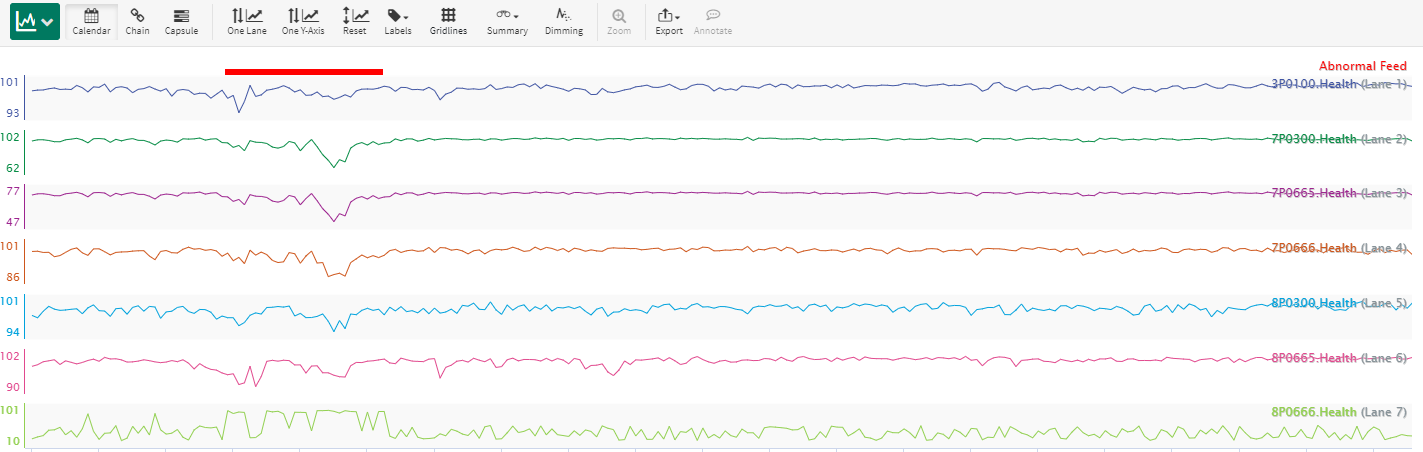
Fig. 64 Trend view of pump KPI (health) across two process trains.
A parallel coordinates view is shown in Fig. 65.
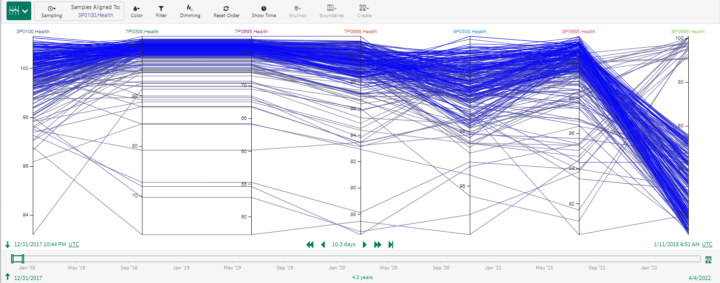
Fig. 65 Parallel Coordinates view of KPIs.
Utilizing the color by condition option (color by Abnormal Feed), the KPI for each of the pumps during the Abnormal Feed condition can be distinguished from other periods of operation. In Fig. 66, the red lines show the KPIs (Health Index) during the Abnormal Feed condition.
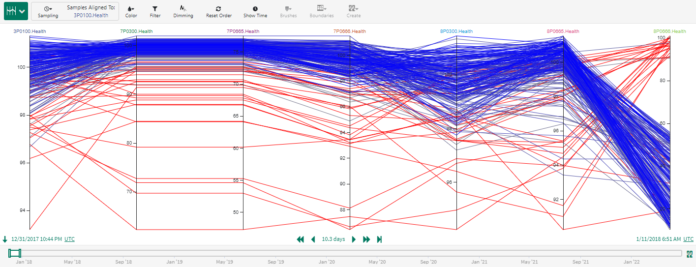
Fig. 66 Parallel Coordinates KPI view using color by condition. Red lines belong to the Abnormal Feed condition.
Fig. 67 shows an alternative view using the time axis. It is visually apparent from Fig. 67 that the KPI for almost all pumps are lower during the abnormal feed period; the only exception appears to be 8P0666 which surprisingly shows a higher KPI during this condition. This KPI and pump may need additional investigation.
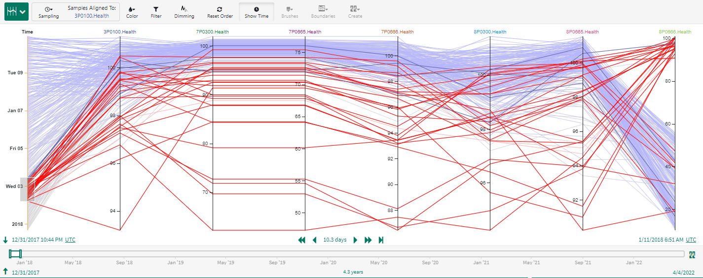
Fig. 67 Alternative parallel coordinates KPI view displaying time axis and using color by condition.
Analyze Constraint Postures for Advanced Process Control (APC) and/or Real Time Optimization (RTO)
It is often desired to compare and contrast constraint postures (at high limit, at low limit, unconstrained) under differing operating conditions. Using Parallel Coordinates in Seeq, the different constraint states can be visually examined and analyzed.
Fig. 68 shows the constraint states for manipulated variables (MVs) for advanced process control (APC) when the process operates with feed blend A. A value of 1 indicates that the MV is at its upper limit, a value of -1 implies that the MV is at its lower limit. If the value is 0, the MV is unconstrained. Notice that when the process is using feed blend A, 11FC101 is always at its upper limit, 11FC102, 11TC301 and 11FC302 are always unconstrained. 11TC101 is either at its upper limit or is unconstrained (never at its lower limit). This view enables the APC engineer to determine if the right constraints are being hit consistently for the APC controller.
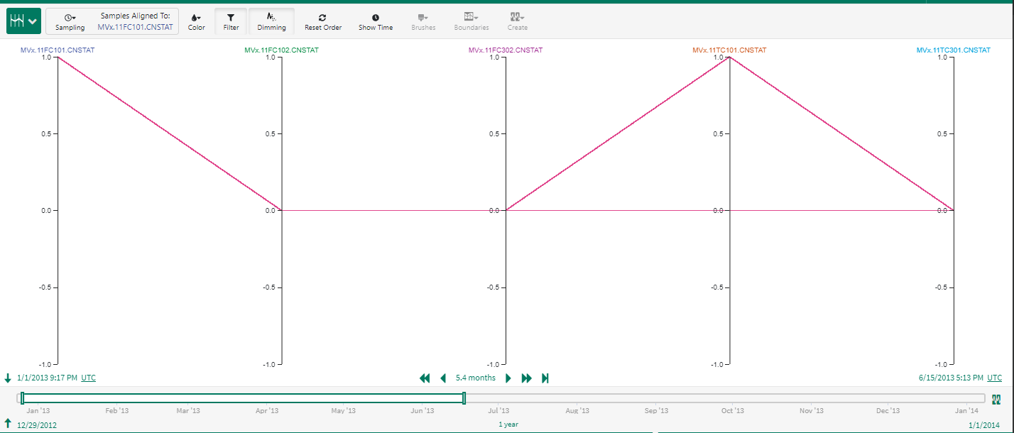
Fig. 68 Constraint posture in feed blend A.
The performance of the APC controller in other states can be visualized and compared. Fig. 69 shows the constraint posture in feed blend C. In contrast to feed blend A, notice that when the process is using feed blend C, 11FC101 is always at its lower limit. 11FC302 is either at its lower limit or is unconstrained.
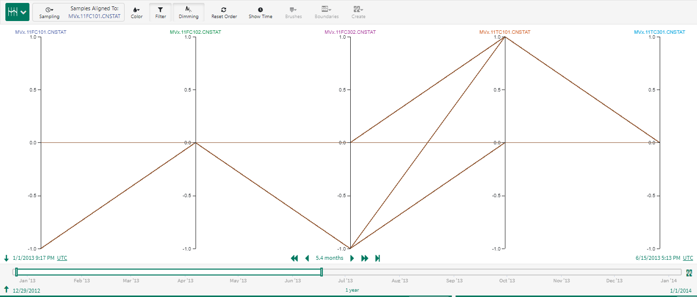
Fig. 69 Constraint posture in feed blend C.
Parallel coordinates is a useful tool to analyze impact of tuning changes for both advanced process control (APC) and real time optimization (RTO). Fig. 70 shows how parallel coordinates can be used to analyze deviations from an RTO external target (ET) as the ET weights are changed.
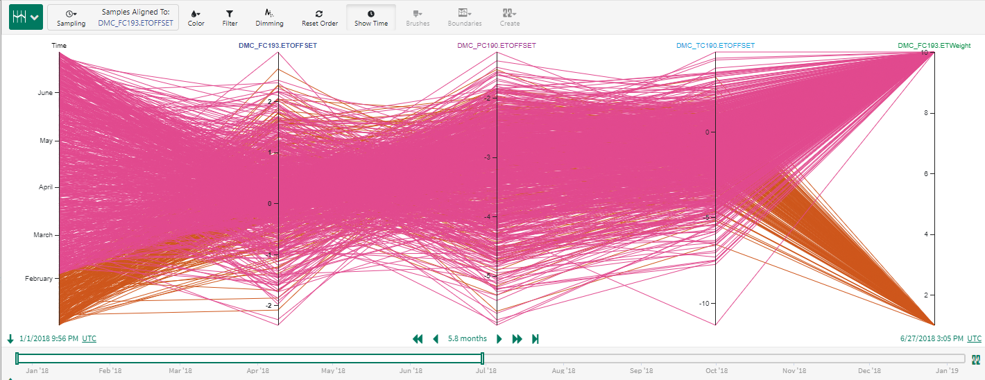
Fig. 70 Impact of external target (ET) weight change on ET offset.
A similar analysis can be performed using parallel coordinates to assess impact of different process states on APC prediction errors. In Fig. 71, the green and blue lines depict different process modes. Such a view provides some quick takeways. For example, the model prediction for RVP is much better in the blue mode than it is in the green mode (higher prediction errors). Column DP on the other hand seems to do better when in the green mode rather than in the blue mode.
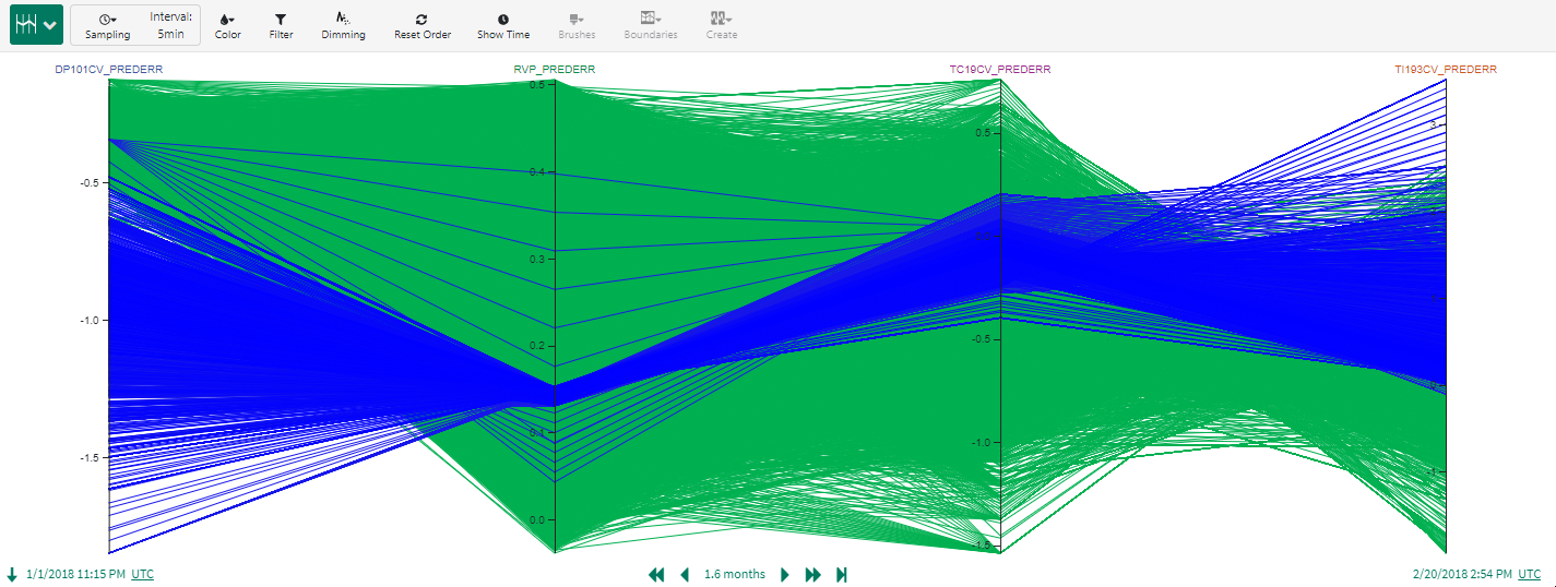
Fig. 71 Using parallel coordinates to analyze impact of different process states on APC prediction errors.