Parallel Coordinates in Seeq 
Basic Display and Manipulations
Both the display range and investigate range behave exactly as they do in the trend view, allowing the time range to be adjusted. Again, as in the trend view, there is an option to display any capsules present in the investigate range.
The order of the vertical axes can be changed by dragging the axis name with the mouse and dropping it in the place it is required.
The scale of the axis can be set using the customize button in the details pane, much as axis can be adjusted on a trend display.
In the chart below, the “Wet-Bulb” signal has been added using the same axis as “Temperature”. It immediately becomes clear that “Wet-Bulb” is always lower than “Temperature” at the same time.
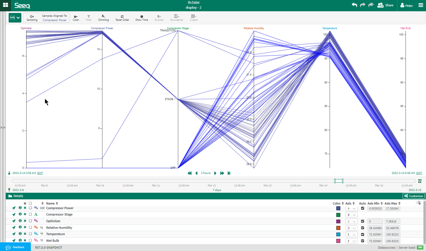
Fig. 4 Customizing ranges in Parallel Coordinates.
Hovering
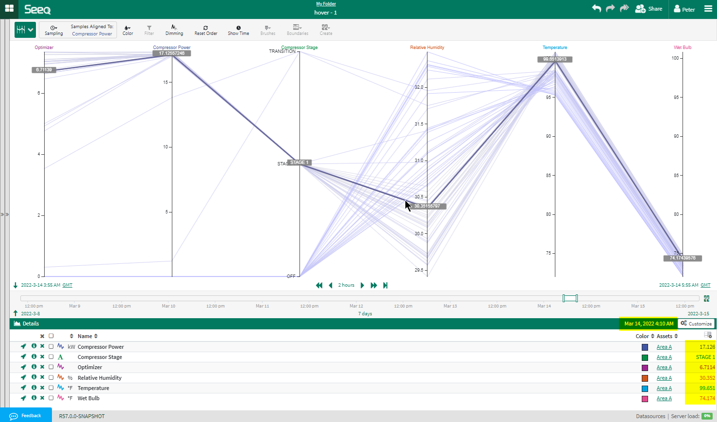
Fig. 5 View values by hovering over a line.
When the mouse is allowed to hover over a line on the display the line is highlighted, and the values are shown in tooltips.
The time corresponding to the line is shown in the title-bar of the details pane and the values are also shown next to the corresponding signal (highlighted above)
Brush Filtering
The values on each vertical axis can be filtered. The mouse can be used to select the range of interest, by clicking and dragging on the axis to select the range. This is sometimes referred to as “brushing”.
The Brush-filtering takes place in the browser with no need to retrieve additional data from the Seeq backend. This results in a responsive, dynamic user experience.
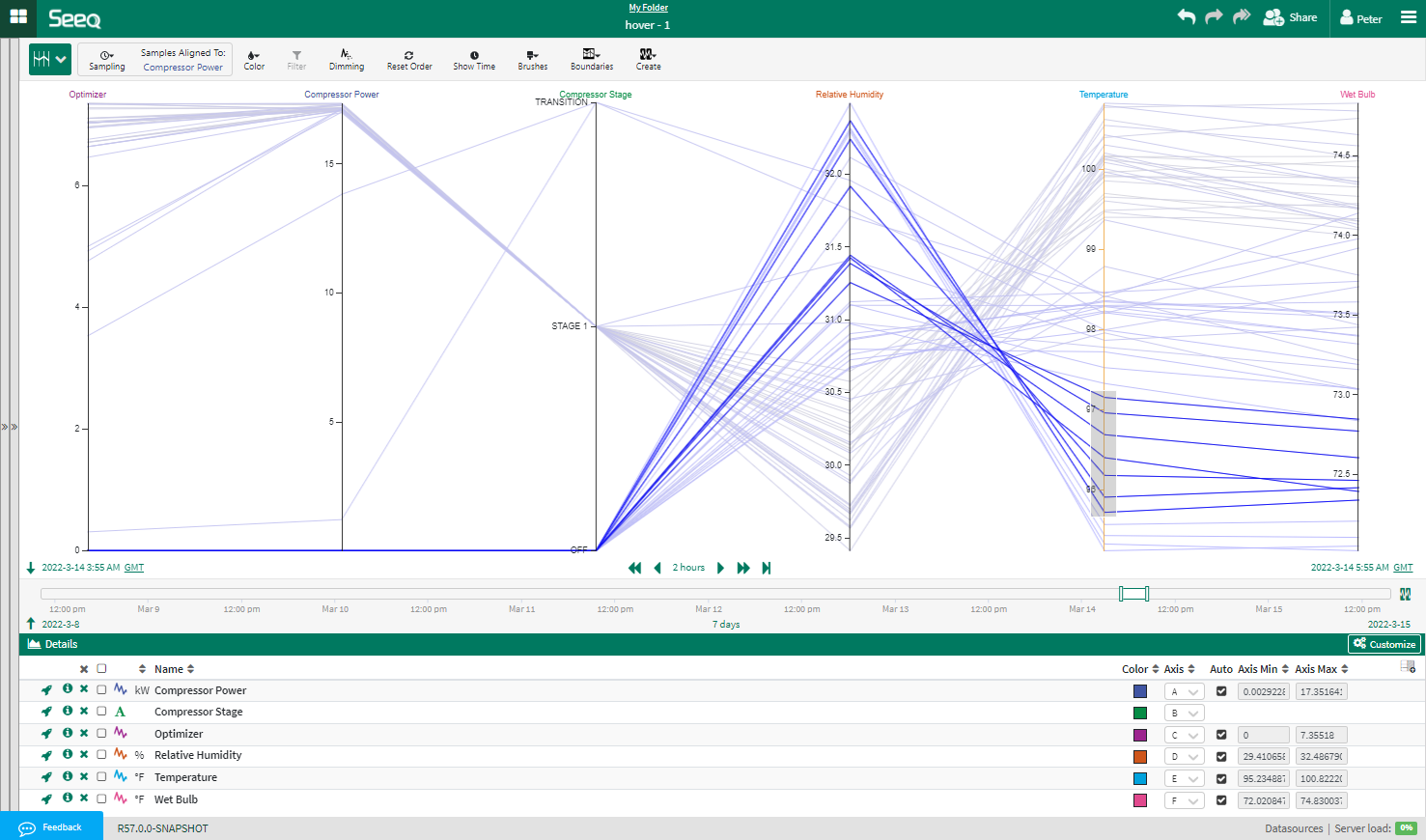
Fig. 6 Using multiple brushes to interactively filter the data.
Multiple Brushes can be set to allow simple interactive investigation of the multivariate data. For example, using the example dataset (an HVAC system), it is possible to find the times when the compressor power is high, yet the temperature relatively low.
Brush filters are persistent and are stored in Seeq as part of the display configuration.
Notice that when a brush is applied the axis affected is shown in orange. This gives a visual indication to the user that a brush is active and avoids confusion if the brushed area disappears from the axis due to auto-scaling.
Lines which do not fall within the ‘brushes’ are dimmed. Lines within the brushes are moved to the foreground and drawn on-top of the others to ensure they are not hidden.
Brushes can be removed from an axis by clicking on the axis outside the “brushed” area.
The Brushes for all axes can be removed by clicking the Clear Brush button on the brushes menu
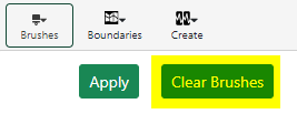
Fig. 7 Clearing all existing brushes using Clear Brush.
Editing brush values
It is difficult to set the values of brush filters accurately using the mouse alone. The brushes menu allows brush filter values to be adjusted by editing their values in a text box. Brushes on String signals and the time axis can only be adjusted with the mouse.
The brushes menu is accessible from a button on the toolbar:

Fig. 8 Setting brush filters accurately.
The button is enabled when any numeric brushes have been added to the display.
Clicking it displays the brushes menu, which allows the adjustment of the high and low limits of each brush.
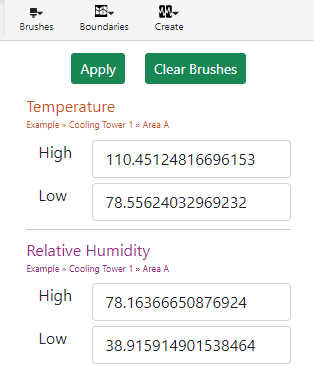
Fig. 9 Manually set upper and lower brush limits.
The values can be edited in this dialogue box and applied by clicking the button. The dialog box closes when the ‘Brushes’ button is clicked, or when the cursor is moved outside the dialogue for more than 2 seconds.
Removing a single limit
The brush filters normally accept values between a lower and an upper limit. However, using the brushes menu, it is possible to remove one of the limits so that the brush becomes a “greater than’ or ‘less than’ filter, depending on which limit is removed. The limits are removed by selecting the text in the text box and pressing ‘delete’
For example:
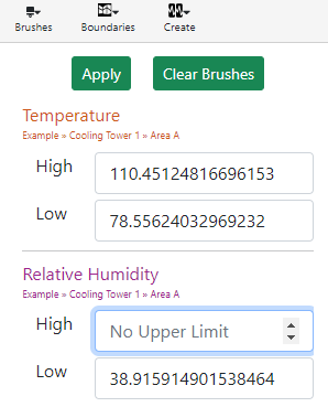
Fig. 10 The brush on the Relative Humidity axis has effectively been converted to a ‘greater than’ filter.
Brushes with no upper limit are displayed extending to the top of the axis with an upward triangle to indicate there is no upper limit. Similarly, brushes with no lower limit extend to the bottom of the axis with a downward pointing triangle.
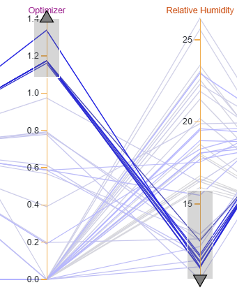
Fig. 11 Brush with no upper limit (left) and brush with no lower limit (right).
Manipulating Chart Axes
Re-ordering Chart Axes
Axes can be re-ordered by clicking on the axis title and dragging it to the required position. The order of the axes is persistent and is stored in Seeq as part of the display configuration.
Resetting Axes Order
The Reset Order button removes all ordering of series. It will restore the series to the original order.

Fig. 12 Button to restore ordering of axes to original.
Sampling, Coloring and Filtering
Several buttons are available in the header bar of the parallel coordinate display. These allow control of the display as follows
Sampling

Fig. 13 Button to specify how data is sampled.
This button above controls how the data is sampled.
Note
There are two options for sampling:
One series can be selected to provide timestamps, all other series will provide interpolated values at those timestamps.
The user can define a fixed sampling interval for all series.
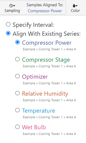
Fig. 14 Specify how multivariate data is sampled. Here Compressor Power is selected and other time series signals are aligned with this signal for sampling.
To select fixed interval sampling, click the ‘Specify Interval’ option and further options wil appear to allow input of the interval:
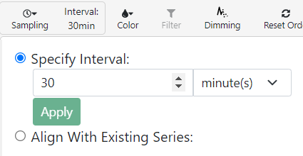
Fig. 15 Specify fixes sampling interval.
Note
The “Apply” button must be clicked to set the fixed sampling period
The current sampling setting is shown on the toolbar next to the sampling button.
Sample Limits
In any web-based system there is a limit to the amount of Data which can be transferred from the sever to the browser. Parallel coordinates sets this limit to 150,000 samples. With a large number of axes, long display intervals and/or high sampling rate, it is possible to exceed this. If this happens the backend will truncate the display period, returning the first 150,000 samples. In order to make sure that the user is aware this has happened, Parallel Coordinates will display a dialog box, as shown here:
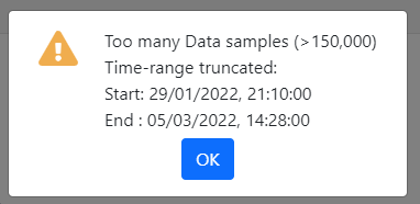
Fig. 16 Too Many Samples dialog box.
This dialog box gives the start and end time of the actual data returned. Pressing the OK button will allow the user to view the data which has been returned. The dialog box will re-appear when the display is re-drawn to remind the user that the sample range is shorter than the one requested.
Managing the number of samples.
Increasing the sampling interval will reduce the number of samples returned in a given time interval, extending the display interval that can be displayed before the limit is reached. Doubling the sample period will half the number of samples returned for a given set of signals and display range.
The number of samples can also be reduced by removing signals and capsules that are not needed.
Each line drawn requires:
one sample for the timestamp
one sample for each signal displayed
one sample for each condition in the details pane
Note
Each condition in the details pane will require an addition sample per line displayed
Signals which are not displayed will not require samples, even if they are still in the details pane
Another way of reducing the sample count is to use filter-by-condition. This filters on the server, reducing the number of samples sent to the browser. A typical use would be to examine a small period, using brushes to isolate combinations of values which are interesting. The create condition feature can then be used, to make a condition equivalent to the brushes. The condition can be used to filter a longer time period on the server, finding the interesting value combinations over a longer time period.
Coloring

Fig. 17 Button for coloring lines.
By default, the coloring of the line depends on the timestamp corresponding to the line. The lines are colored blue, but the saturation of the blue color increases as the time progresses. Thus, older lines are shown as a blue-grey, and most recent lines as bright blue.
Using the color button it is possible to change this default and select coloring based on the value of one of the signals. The color of the line is based on the color of the signal (settable from the customize pane) and the saturation increases as the value of the signal increases.
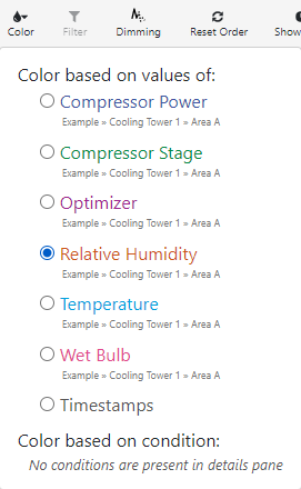
Fig. 18 Relative Humidity is selected. Parallel Coordinate lines will be colored based on signal value.
Additionally, if conditions are present in the details pane, lines which fall within the conditions can be highlighted. Such lines are colored by the color associated with the condition
Note
Color corresponding to a condition can be changed from the Seeq Details Pane.
In the example below, the display is colored by the value of relative humidity: Low values appear grayish. The saturation increases with the value of relative humidity; the highest values are displayed in orange, the color selected for the signal in the customize panel.

Fig. 19 Example of coloring based on signal value. Lower values appear graysih; higher values appear orange.
If a condition is selected in the color dropdown lines, correspond to lines occurring within that condition will be highlighted. This overrides the coloring based on value.
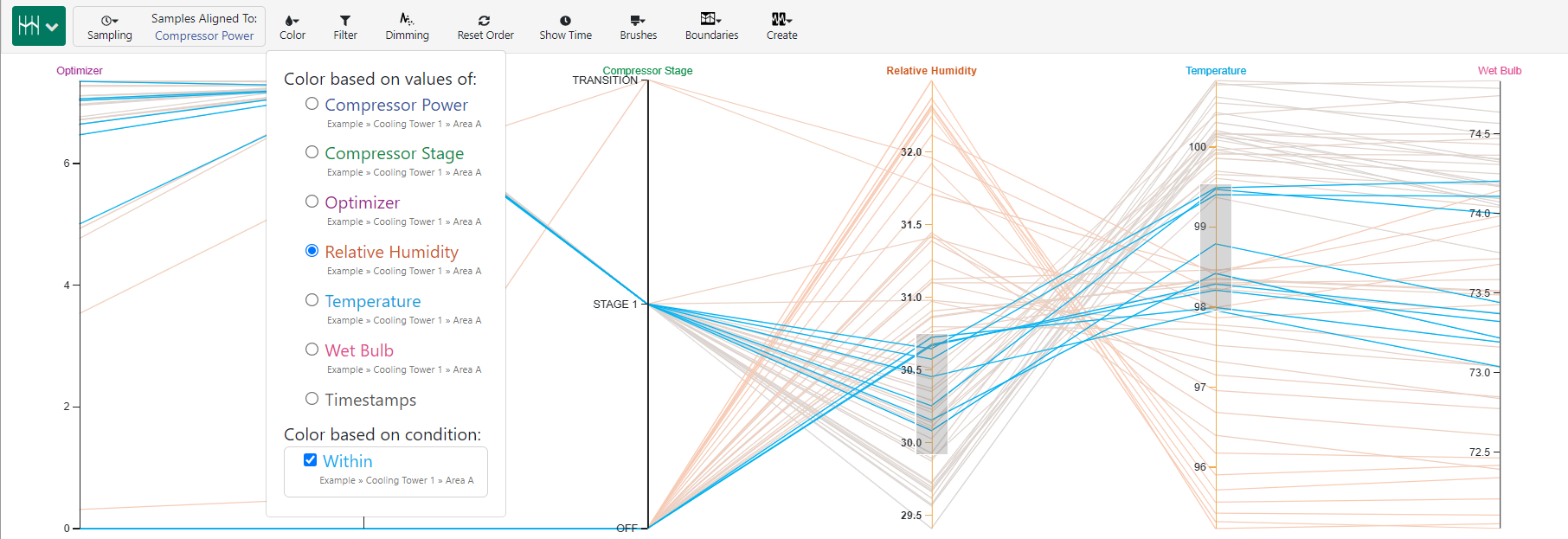
Fig. 20 Example of coloring based condition. This selection overrides coloring based on signal value. All time series in the period belonging to selected condition (‘Within’) is colored in Cyan.
Priority of coloring
If multiple conditions are selected in the color menu, a line which falls in more than one capsule will be colored by the capsule which is highest in the list in the drop-down (top of the list). The order of the selected capsules can be changed by dragging and dropping the conditions in the drop-down.
Filtering by Condition/Capsule

Fig. 21 Button for filtering by condition/capsule.
Note
If the filter button is selected only lines correspond to samples occurring within conditions in the details pane will be displayed.
If any of the conditions are selected in the details pane only the selected conditions will be displayed.
It is also possible to filter by the individual capsules which make up the conditions. While the filter button is selected, selecting one or more capsules in the capsules pane will only display lines that fall with those capsules.
Selected Series

Fig. 22 Dimming Button to select series to display/hide.
The “Dimming” button controls what happens if series are selected in the details pane. If no series are selected there is no effect.
By default, if any series are selected in the details pane all unselected series will have their axes displayed “dimmed”. In Fig. 23 “Compressor power” and “Compressor stage” are “dimmed”
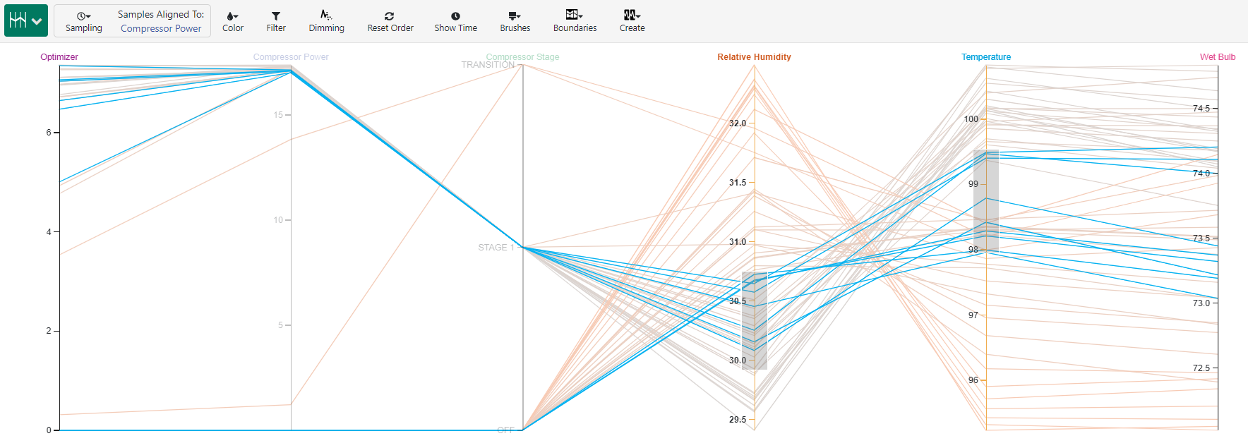
Fig. 23 Compressor power and Compressor stage are “dimmed”.
This is analogous to the effect of selecting series in the trend view. It can be used as a quick way for the user to verify which axes correspond to which series in the details pane.
Selecting the dimming button, will hide the unselected series:
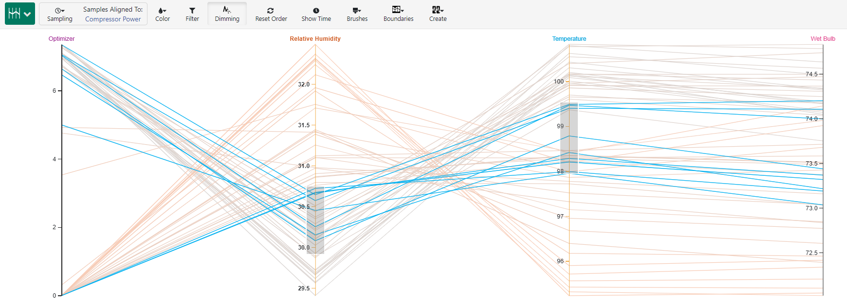
Fig. 24 Hiding unselected series. Compressor power and Compressor stage are no longer displayed.
In this mode, series can be added and removed from the display by selecting/unselecting them in the details pane.
If an axis has a brush applied or has been repositioned when it is de-selected the axis will be removed but its settings will be preserved. If it is re-selected, the axis will reappear in the same position and any brush will be restored.
The settings for individual axes are only removed when the series is deleted from the details pane.
Display Time Axis

Fig. 25 Button to toggle display of time axis.
Clicking the Show Time button adds a further axis to the display which displays the timestamp of the values. Each line on the display is connected to its timestamp on the ‘time’ axis. This axis behaves in the same way as other axes. It can be repositioned and Brush filters can be applied:
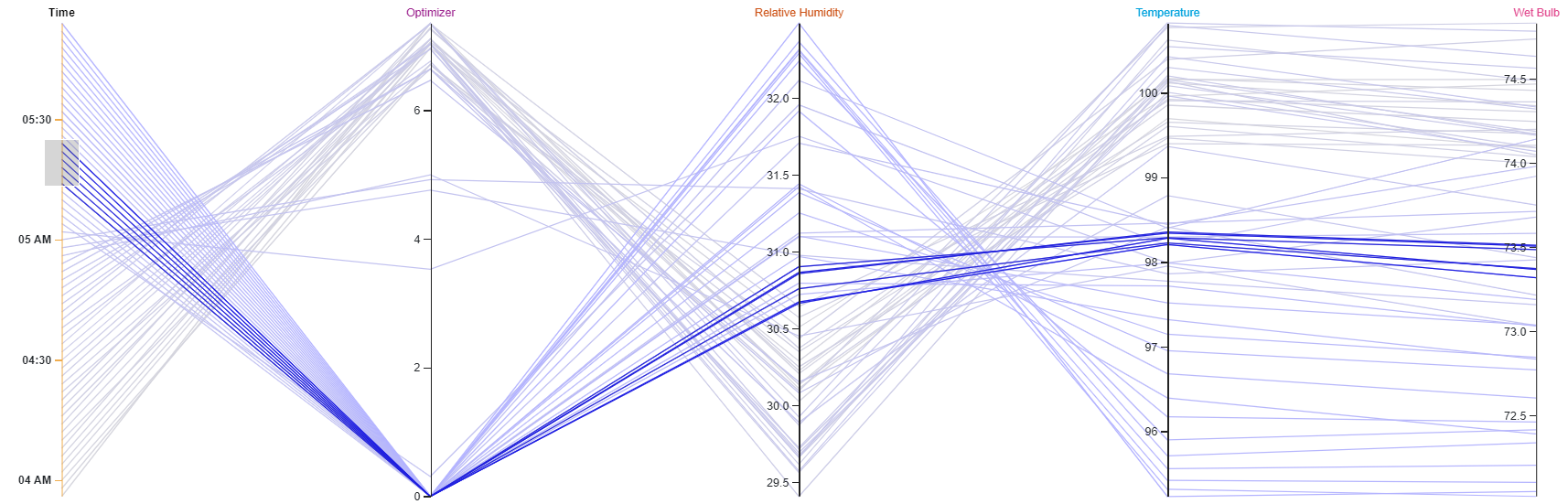
Fig. 26 Applying brush filter on time axis.
“Sliding” a small brush on the time axis provide a way of viewing how the relationships between the other values change with time. As all the data is already loaded into the browser, this is faster than changing the display interval.
Hovering over a line will display its timestamp in a tooltip.
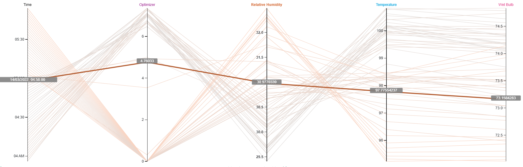
Fig. 27 Displaying timestamp as a tooltip.
Creating Conditions

Fig. 28 Creating a Seeq condition from parallel coordinates.
When one or more brushes are present on the axes of a parallel coordinates visualization, the create button will be enabled. If it is clicked, the formula tools will open in the Tools pane prepopulated with a formula which will create a condition replicating the effect of the filters. The name of the formula can be entered by the user and clicking execute will generate a condition. The formula can, of course, be modified in the formula pane if necessary.
Note
Only axes currently displayed on the screen will be used in the generated condition.
Unwanted axes can be removed from the screen by enabling “dimming” and un-selecting the series in the details pane, before generating the condition. The values of any filter removed in this way will be remembered when the series is re-selected.
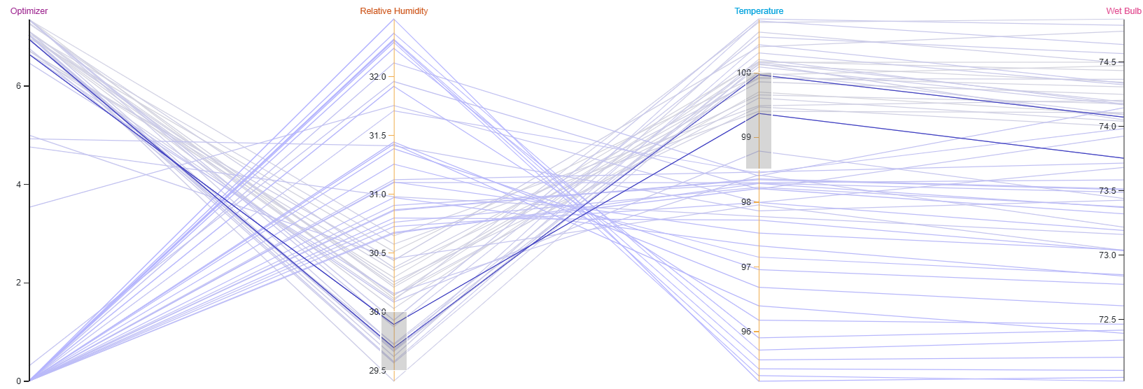
Fig. 29 Create a condition automatically from brushes placed in parallel coordinates view. After placing brushes as shown above, select Create.
The create button offers two options in a drop-down menu:
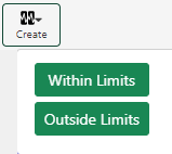
Fig. 30 Options for creating a condition from parallel coordinates
Note
Select Within Limits to generate a condition which will contain lines within the brush filters.
Select Outside Limits to create a condition containing lines which fall outside the brush filters.
The generated condition using Fig. 30 uses “and” and “or” operators to make them more readable
For this example, let’s select Within Limits. The formula shown in Fig. 31 is generated automatically in the Seeq Formula Pane. A user specifies a name for the new condition and clicks Execute to complete the creation of the condition.
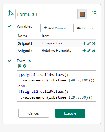
Fig. 31 Seeq Formula for creating the condition corresponding to the brushes in Fig. 29 is generated automatically. Provide a name for the condition and select Execute.
Note
Brushes on the time axis will be included in the condition if the time axis is displayed.
Boundaries
Boundaries are another way to use the values provided in brush filters. Rather than filtering, the values are displayed as colored boundaries on along with the parallel coordinate lines.
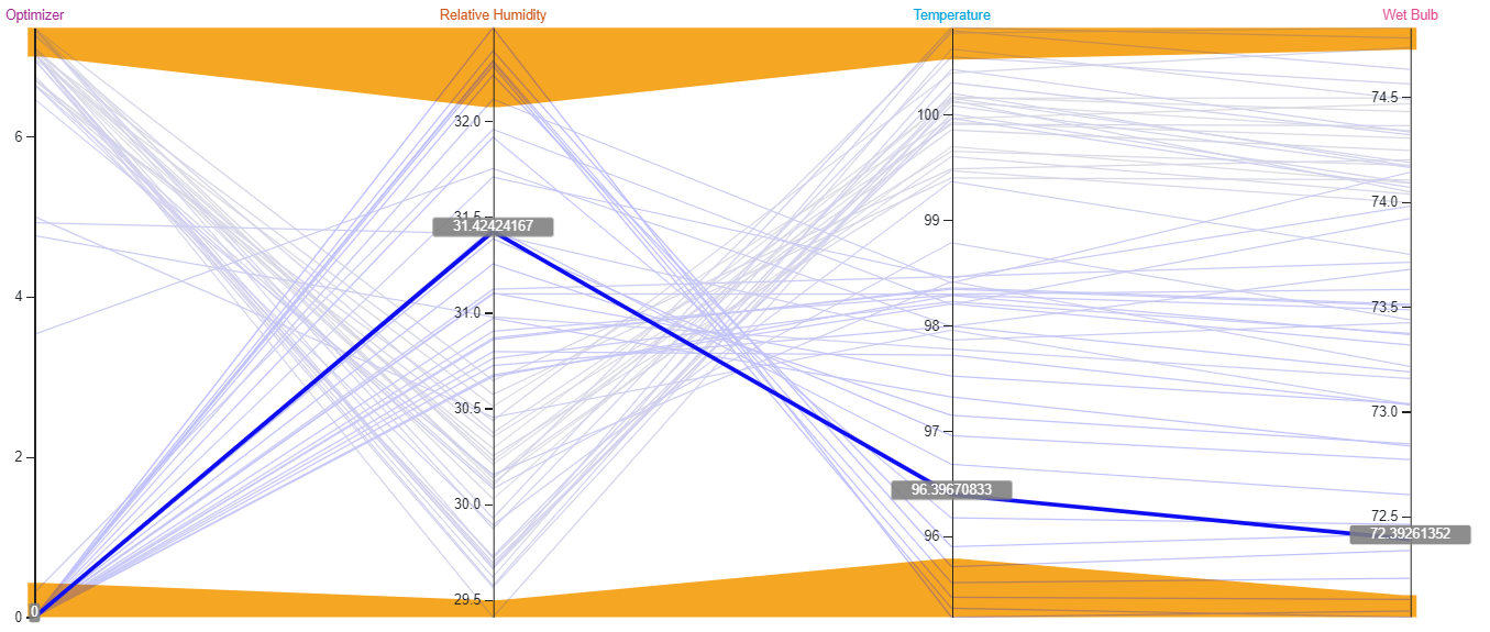
Fig. 32 Overview of Boundaries in parallel coordinates.
An arbitrary number of boundaries can be displayed as shown in Fig. 33.
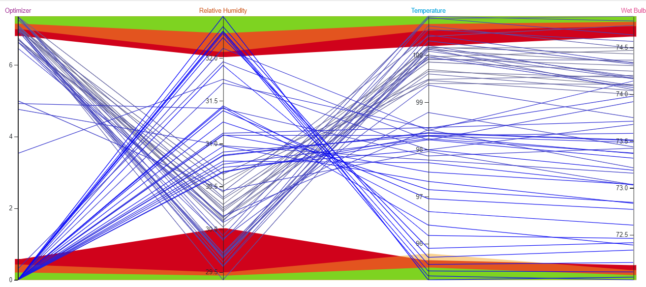
Fig. 33 Multiple boundaries in parallel coordinates.
Creating Boundaries
To display a boundary, first create a brush filter. The Brushes menu can be used to accurately set values (see Editing brush values). The Boundary menu can then be used to create a boundary.
Fig. 34 Creating a boundary for Parallel Coordinates.
Once the Boundary is created it will appear in the Boundaries menu. The boundary will be assigned a unique name, of the form “Boundary x”. Users are encouraged to give boundaries more meaningful names by editing the name in the Boundaries menu. These names are solely for the convenience of the user in distinguishing multiple boundaries.
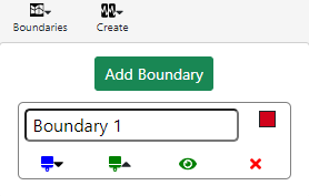
Fig. 35 Created Boundary appears in this list. Provide a meaningful name when creating a boundary.
Boundaries are also assigned one of 15 unique colors. Every attempt is made to unsure that each color only appears once in the list, but in the unlikely event of there being more than 15 boundaries the colors will start to repeat.
Setting Boundary Colors
The colors can be changed manually by clicking on the colored square on the right of the Boundaries name. A “color picker” will appear:
Fig. 36 Changing color for boundaries using the color picker.
The color can be set by:
Clicking on the required color
Using the sliders
Typing numeric values into the R (Red), G (Green), B (Blue), (A) Alpha text boxes
The R,G,B values control the intensity of the color ranging from 0 to 255.
The Alpha value sets the transparency of the color. Ranging from 0 (completely transparent) to 100 (completely opaque). It may also be set using the lower slider. By default, colors are opaque.
Boundary Controls
 This button exports the values from the boundary
to the brush settings (overwriting any brush setting which exist). This allows the values to be edited using the Brushes menu.
This button exports the values from the boundary
to the brush settings (overwriting any brush setting which exist). This allows the values to be edited using the Brushes menu.
 Clicking this will update the values of the
boundary from the values held in the current brushes. If there are no current brushes the button will be disabled.
Clicking this will update the values of the
boundary from the values held in the current brushes. If there are no current brushes the button will be disabled.
 This button toggles the visibility of the
boundary. It is green if the boundary is currently visible and black if it is hidden.
This button toggles the visibility of the
boundary. It is green if the boundary is currently visible and black if it is hidden.
 This deletes the boundary. The user is asked to
confirm the deletion before it takes place.
This deletes the boundary. The user is asked to
confirm the deletion before it takes place.
Ordering Boundaries
Boundaries are draw on the Background of the chart, in the order shown in the boundary menu (top to bottom). This means that lower boundaries can completely obscure higher ones if they have tighter limits.
To prevent this the uses can re-order the boundaries in the boundary window by dragging and dropping the boundaries with the mouse. In some cases, it may not be possible to order the boundaries so that all the limits can be seen. In this case the use of Semi-transparent colors for the boundaries is recommended.
Using boundaries to store multiple brushes
Brushes and boundaries share the same values. This makes it possible to use boundaries as a way of storing brush setting
for future use. The boundaries can be hidden using the
button, and then exported to the brushes when they need to be used.
Highlighting time series outside of a boundary
The close relationship between Brushes and Boundaries can be used to color lines which exceed the boundary limits.
As an example, consider the display below:
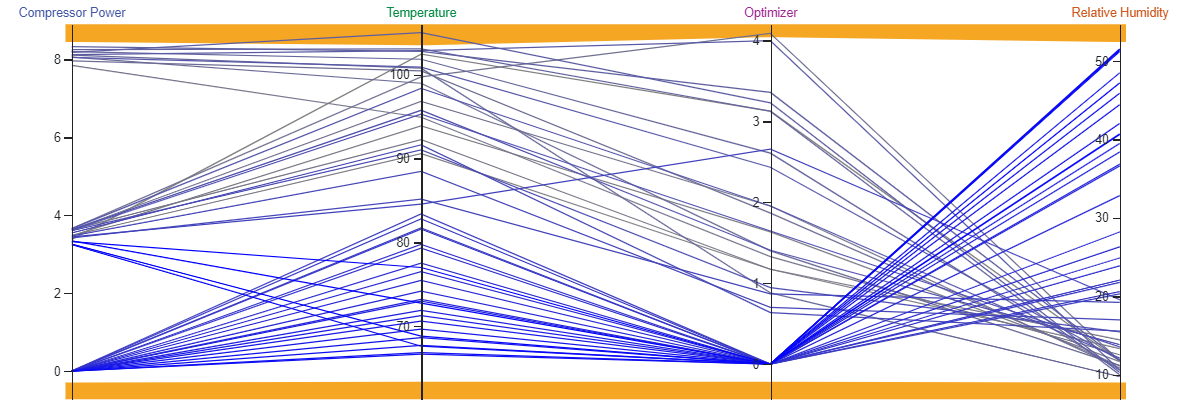
Fig. 37 Parallel coordinates example with boundaries. We want to highlight data falling outside the boundary.
Using the Boundaries menu, the values of the boundaries can be exported to the brushes by using the green brush (the upward facing triangle next to it is to indicate “exporting”).
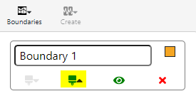
Fig. 38 Export boundaries to brushes.
When brushes are visible, use Create to create a condition and choose Outside limits (See Create Conditions).
Fig. 39 Parallel coordinates view with boundaries exported as brushes.
The generated formula for the condition will appear in the Tools pane. Enter a name for the condition (1) and click execute (2)
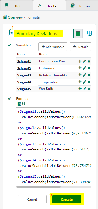
Fig. 40 Create condition corresponding to boundary deviations.
The condition will now appear in the Details pane. The brushes can now be removed.
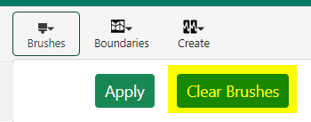
Fig. 41 Remove/Clear brushes.
Using the color menu, lines failing within the condition can be displayed using a different color.
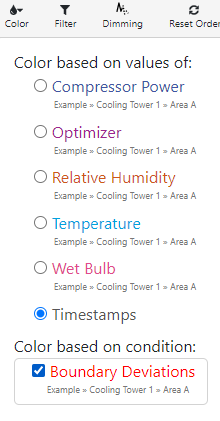
Fig. 42 Display condition with different color.
The color corresponding to this deviation condition can be changed by clicking on the color square for the condition in the details pane
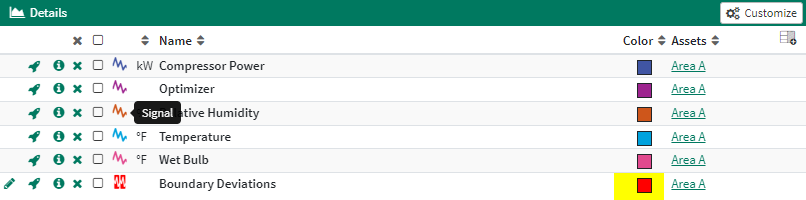
Fig. 43 Change color of condition (if needed) from Details pane. Here we select red.
The deviating lines are highlighted in red.
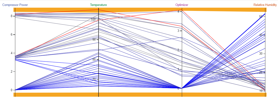
Fig. 44 Deviations are in red and can be distinguished from non deviating multivariate points.
The time of the deviation can be seen by hovering over the lines with the mouse and/or by clicking the show time button to add a time axis to the display
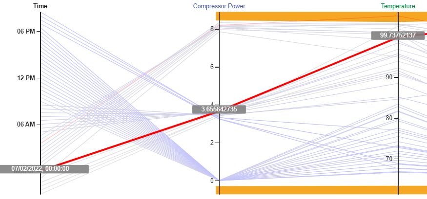
Fig. 45 Determining time of deviation using the time axis.